The right tone for a major player in the renewable wind sector
Design + project lead
-
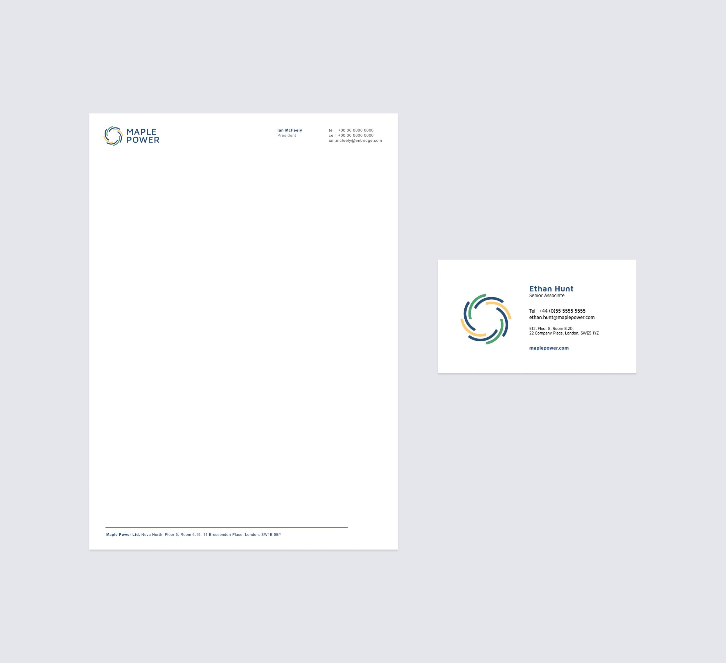
Maple Power is leading developer in the European offshore wind sector. This newly established entity required visual branding, collateral design and a brochure website.
-
This project began by working with the Maple Power team to better understand the company’s vision and how that could translate into an effective visual brand. They needed a visual look that was well received in their industry. They also needed a toolkit to reference when creating detailed business materials. To achieve this we created a logo mark that’s inspired by the movement of a wind turbine. Colours were pulled from natural elements like the sun, sea and land. A modern sans serif typeface was chosen to give it a elegant but capable feeling. After visual branding was completed, a full branding kit was created for the logo usage, followed by print collateral, an extensive internal powerpoint template and a simple self-managed website.